Is Your Site Delivering a Great User Experience?


'User Experience is not a differentiator anymore; it's a necessity'
This, from The State of UX in 2016, underlines that although the importance of website usability has never been in doubt, 2016 has become a playing field which is placing ever-increasing emphasis on the User Experience (UX) of sites.
Search engines now consider UX when returning organic results. People's attention span is reducing with the move towards mobile devices and the online marketplace is more competitive than it ever has been. The time is ripe to ensure that service isn't being undermined by poor UX.
According to content marketing guru Aaron Orendorff, of the Content Marketing Institute, 'you have 5 seconds to engage a customer before they leave the site.'
A mere 5 seconds. Let that sink in.
Before your great content or business has had a chance to be consumed by a potential customer, they could already be gone. A Google report found that almost 80% of users will move to another site if they fail in their search or, simply, don't like what they find!
Naturally, therefore, it stands to reason that optimising the usability of your site can have one of the largest actionable impacts on decreasing your bounce rate and move you towards the great User Experience we all crave.
'How was that for you?'
Delivering great UX simply means making tasks easy to complete.
A customer-centric build should and must be the focus of anything that you choose to implement on your site. What business problems do your customers face? Why have your potential customers come to your site? What are they trying to accomplish? What are they trying to find?
With this in mind, easily accessible feedback buttons or bars are a great way to get instant (and specific) usability feedback.
However, err on the side of caution when it comes to long winded, open ended text boxes. Users are far more likely to click a Yes or No on a brief, specific suggestion which you have provided than take the time and effort to give detailed feedback.
Nothing could be more off-putting than an irritating feedback box within an already unusable website.
Simply simple
Your website might look great, with awesome content, offers that are on-point and navigation that you find fantastic to use. But, even if your website ticks all of your boxes, it may not for your potential customers.
Although a task like finding the search button or menu bar may be easy for you to complete, Google found that 61% of users would move to another site if they didn't find what they were looking for immediately. This certainly indicates that simple navigation is key to delivering your great UX.
Simplicity is certainly where great UX websites in 2016 are heading with clean, bold design focused on accessible navigation.
This means the purpose of the user's visit is answered quickly and the search bars, menus and the concept of the entire company are clearly found or explained seconds within the page loading. A user should know they are on the right website as soon as the page loads.
This cracking example from Lush.com illustrates this instant simplicity. Obvious what their service is? Tick. Obvious navigation? Tick. Search function? Tick.

Speed is king
Nobody likes waiting. Not for buses, the shower or web pages. Google and your users are no different (although Google may not fair too well in the shower).
Slow website are penalised, not only by Google itself, but users clicking off them and doing their searching elsewhere.
'A mere second delay can result in a 7% loss in conversions, 11% fewer page views, and a 16% decrease in customer satisfaction' according to the Content Marketing Institute.
This directly and undeniably affects your ability to deliver a great user experience.
But how do we ensure we aren't failing into this UX no-no? There are plenty of free online tools which can diagnose whether your site is undermining your good work. Google's PageSpeed Insights is my preference.
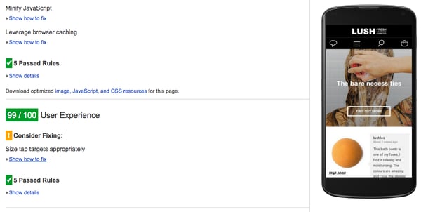
This not only gives you troubleshooting (hurrah a fix!) on specific issues, but also scores your site based on mobile and desktop performance. The icing on the cake is the rather wonderful User Experience rating assigned to your mobile site. As above, Lush.com have nailed it.

Site speed and its effects on conversion, naturally, affects your bottom line. The figures on this are stunning, with my favourite coming from cloud testing tool Load Storm that notes Mozilla-made pages load 2.2 seconds faster. The increase in Firefox downloads? 60 million.
The mobile UX
We all know that optimising your mobile site is the most important thing since sliced bread. I could fill an entire blog with statistics related to the increasing numbers of users and consumers who now shop, search, click, read and watch on mobile devices.
But this shouldn't detract from the important role mobile sites have in ensuring you are delivering a great User Experience. As mobile devices become people's primary source of surfing, ensuring your site is able to provide great UX should be one of your central concerns.
No longer is it just enough to have a responsive website, but one which can detect and react to screen type, finger size and the amount of pressure used. This, according to Elegant Themes' Randy Brown, means everything from buttons 'menus, and so forth should be developed with mobile in mind.'
Optimising your mobile site in this way will ensure you are delivering great UX across all devices no matter the brand, screen size or orientation. Buttons should be large and far enough apart that they aren't clicked accidentally. Images and video are also far more desirable; they are easier to select, add colour to your site - especially with modern screens - and will draw users in (particularly on home pages).
However, be warned. The more images you possess the slower your pages could be and the less text search engines have to crawl through. This can become a balancing between SEO best practice and UX.
Conclusions
Best practice when it comes to User Experience is simply to ask your customers, see what works and ensure you have a package which is optimised for all devices.
Clean, simple design will always trump a messy, information-overloaded page in every respect. You look to delight and help your potential customers whenever possible across your business and the creation and management of your web solution should be no different. Which begs the question:
Is your user experience delivering great User Experience?
More from Website Conversions

5 Examples of Great e-Commerce Websites Nailing it
As with football teams and music, the digital team at Purple Frog has its favourites when it comes to e-Commerce websites and...
7 of the Best: Our Favourite Mobile Website Designs!
On one level the look and functionality of a website on mobile should just do the bare minimum. However with it now official...


