Lost & Confused? Why navigation & content structure are so important!


New look, same blog!
As you might've read a few weeks ago, Purple Frog Digital have begun offering Health Checks as part of their expert service. This analysis and independent insight has given them an unique look into the various issues that afflict many sites across the web.
We mentioned navigation and poorly structured content in that article (if you haven't read it you really should), as it came up as one of the five most common issues that we see time and time again when auditing sites.
Content, and navigating users around a site is a massive part of a successful website and failure to do so will likely be giving a poor experience to your users. This is something that Google mentioned in it's latest Webmaster's blog: Saying goodbye to Content Keywords.
Here they have put emphasis on "be(ing) clear about what your site is about, and what you'd like to be found for. Tell visitors what makes your site, your products and services, special!'.
Although in this case Google is talking directly about content, it can still apply to structure and navigation. It still all comes under the umbrella of providing a good User Experience; a good User Experience will deliver more conversions. Simple.
Navigation
What exactly do we mean by navigation? Basically directing users and customers correctly around your site and delivering them content at appropriate moments.
This can be done a number of ways, and perhaps this can be visited in at a some point in the future, but mega menus, good search functionality and side bars are all excellent ways of delivering this cornerstone of any good website.
A user should be able to use your website without having to read a manual or have any prior training! Think of how effectively Apple constructs its products so that a manual is never really included with its boxes. This thought-process should be applied when designing and laying out your site.

One important aspect to remember is that what makes sense for you, does not mean it will work for you customers! Just because you think of your products and being grouped and link in that way doesn't mean they will. Remember, you have a far better understanding and knowledge of your products than your users and potential customers do!
Content Structure
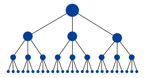
I have touched on this briefly above. But structuring your content in a straight forward way is crucial to maintaining users interest in your site. Confusing, or poorly structured sites (sites that have lots of width but no depth for example), will mean users can be confused by where things will be located.

A good guideline when deciding how best to structure your site is using Google's best practice: this will also have a secondary benefit of ensuring Google can index your site correctly.
Google's spiders like to crawl well structured sites; they determine a good structure by following breadcrumb URLs. So for example: https://www.yourwebsite.com/products/product-category/sub-category/specific-product etc.!

Setting your site up with a clear hierarchy will enable content to exist in 'Content Silos' which - providing you have 250 words per page - will give your site an easy-to-understand, broken-down structure which users will be able to navigate with ease.
This will also benefit SEO and Google's ability to correctly rank your content.
Conclusions
So what can you take away from this? Simply, that the Structure and Navigation of your website is the most important aspect of your content.
As with a website's relationship with SEO; having great content is pointless unless you have the correct structure and usable navigation. This will enable you to serve up the right content and the right time.
Happy restructuring!
More from Website Conversions

C'ya Content Keywords: but what does this mean for SEO?
What on earth are 'Content Keywords' when they're at home? Are they important...? Should I care? These are just some of the...
What is SEO?
Successfully increasing your company's website visibility is the bread and butter for any business looking to generate more...


