5 Great Call-to-Action Examples That We Just Couldn't Ignore!


It may seem obvious but surely the purpose of a Call-to-Action (CTA) should be to grab your attention and shout "CLICK ME!"? This is what we look for on websites whether they be income or lead generators and if your CTAs don't crackle and buzz you could be missing out on huge amount of revenue!
Having great on-page e-Commerce SEO and fantastic user experiences are useless if you lack the final killer action that you need your customers to take. It's the principle also of a good inbound marketing strategy, which we are advocates of.
We couldn't agree more and as she says "Prospects crave something different." Something different here is key to help your product pages and e-Commerce stand out from the crowd!
So here to help are our 5 Great Example's of Calls-to-Action That We Just Couldn't Ignore to help you with your next e-Commerce CTA! You're welcome...
Have great landing pages and CTAs is just one part of nailing your e-Commerce website. Make sure Google isn't ignoring your site with our FREE tool!
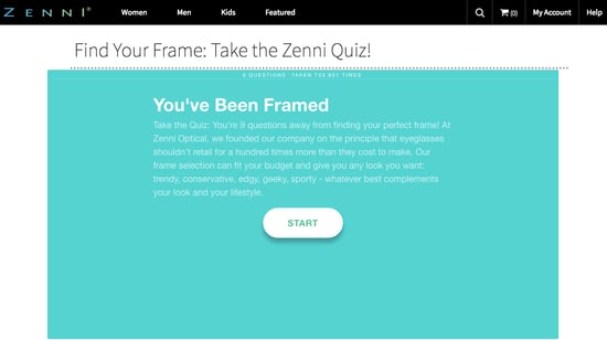
1. Zenni
This is simple and oh-so-affective! Zenni - an optician - have come up with a sure fire why to get you to click into their website and take an eye test...
Making excellent use of a Start button and the prospect of a quiz upon entry, users have to engage if they wish to find out more. This is a brilliant example of giving your audience no other choice and it works fantastically with a reported 60,000 people having already taken it!
2. Huemor
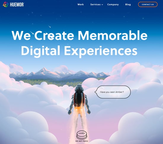
This creative design agency based in New York have thought out of this world (yes pun intended) for this CTA. Again using simplicity and cheek they make it an impulsive decision to click their CTA.
Who can resist a big button with launch on? Nope me neither and when that button has "DO NOT PRESS" underneath it the urge is simply to big not too! Excellent reverse psychology at play here and Huemor use it brilliantly. Top work!
3. The Carry on Cocktail
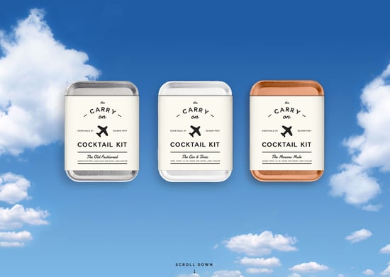
Again simplicity is always always better! This miniature cocktail kit company from the US ensure that users do something as soon as they enter the site with the beautifully designed landing page.
Using a CTA that just asks the user to 'Scroll down' its fair to say there's only one thing one does upon entering the site. The rest of the page and site is engaging and you quickly become immersed in their content but this is only possible with a great CTA steering traffic further into the site.
4. Dropbox for Business
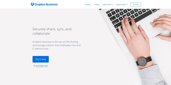
Dropbox certainly wasn't the first and it won't be the last company to offer free trails of 'stuff'. Nor will it be the last cloud based storage system that are populating the web at the moment.
However they are likely to be increasing their sign-ups with this awesome landing page and CTA. There isn't anything not to love about this page. The agile and clean design play off the overall feeling that you have only one choice in this situation. This page also shows the importance in tone and prose of your language when creating your CTAs. Engaging without being in your face is key here!
5. Full Bundle
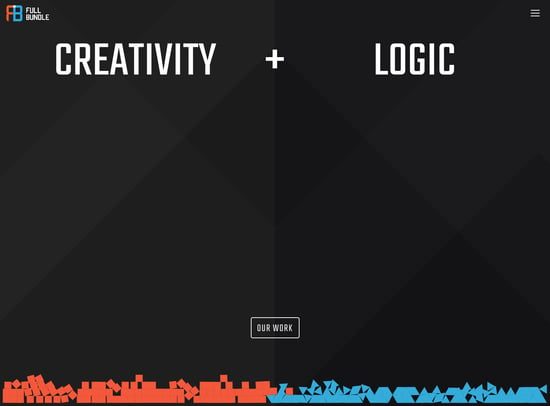
The best till last! Full Bundle - a creative agency based in the UK - have created something truly brilliant here. If this doesn't get you to click-through then nothing will.
In a full display of their skills and creative nature, Full Bundle frankly blow my socks off with this CTA. Creating a landing page that looks like a 1980s video game, the entire page reacts to your mouse sending red cubes and blue triangles shooting and spinning across the screen in quite comical fashion.
I won't deny that I spent quite a well playing with this before eventually clicking on through however let nothing be taken away from this excellent CTA. This is the ultimate display of getting your users to engage with your pages. So, so good!
Conclusions
Although not always practical for e-Commerce and certainly not all product pages, the main takeaway from these CTAs should be to think outside the box and aim to blow your audience away with what you design.
A call-to-action should always aim to hook your users into another action and failure to do so will make your efforts in other areas - UX and SEO - pointless if you can't keep potential customers engaged! Basically, go wild! Anything goes!
More from Inbound Marketing

5 Examples of Great e-Commerce Websites Nailing it
As with football teams and music, the digital team at Purple Frog has its favourites when it comes to e-Commerce websites and...
5 Simply Brilliant Landing Page Examples From Around the Web
The inter-web is a busy, competitive place, and certainly one where poor design and naff, annoying messages are punished by the...


