7 of the Best: Our Favourite Mobile Website Designs!


On one level the look and functionality of a website on mobile should just do the bare minimum. However with it now official that more people are accessing the internet on mobile devices, developers the world are expanding the possibilities of responsive designs.
The user experience designers are here!
Sites now look to utilise the full capabilities of mobile devices with great functionality, usability and animation being at the heart of any great mobile site.
Thus it seemed only right that we take a look at what it means to have a truly great UX on mobile.
These sites stand out not simply because they look good but rather their great functionality, simple user journey's and are intertwined with large doses of creativity.
Google Maps
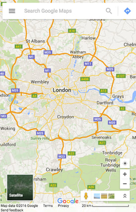
Why not start with the pros? Google's highly successful Maps have been the go-to mapping and route finding service for 11 years (yes it has been that long and I feel old too).
With the launch of the mobile app back in 2008 it might appear that the mobile version of Google Maps would be neglected. But instead Google have streamlined the entire service so that their mobile version runs parallel with its app,thus creating a beautifully familiar user-friendly design, which behaves identically to its popular app.
The floating search bar and use of swipe-able side menus give this the look and feel of an app. This reduces users having to relearn the process and creates a clean view that is sometimes lacking on smaller devices. Genius!
LUSH.com
We have praised them before for having an excellent User Experience and unsurprisingly the boys and girls at Lush.com have continued this over to the mobile site.
The big, bold and easily click-able buttons dominate the top of the screen meaning that even on the smaller devices (iPhone 4's etc.) users can get access to the menu just as quickly as on other larger screens.
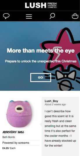
The resolution is very high and the clean animations of the drop-down menus give the entire site the "straightforward" feel which encompasses the brand. This is a constant throughout the site and means navigating the site is incredibly easy.
Knowledge Is King
Need motivation?! Go to KiK. This motivational and life-help WooCommerce site is a rival to Amazon in terms of its functionality and usability. But it actually beats the giant when it comes to its mobile site!
The fantastic use of side menu and search feature housed with in mean that this site holds all the anwsers when it comes to you finding the book or product that is right for you.
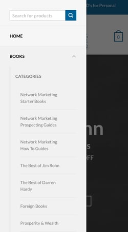
Having a search feature within a side menu is not normall something down due to the lack of space on small screens. But this has been pulled off to great effect here with KiK successful moving customers quickly around their site whilst not cramping the menu!
Well done chaps.
FIREBOX
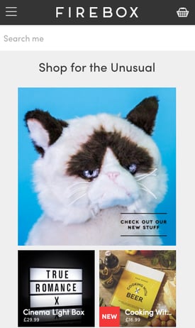
'Shop for the Unusual' is the company's motto of this wacky and innovative supplier of the weird and wonderful. They provide everything you could think of, and a few that you definitely would not.
Chair socks (yes, that is as it sounds) being the tip of a very oddly brilliant iceberg.
But in terms of the mobile website they have nailed what their target user is looking for. The large search bar which stretches across the screen is on every page. This allows users to search for anything wherever they are on the site.
Again, there is good use of a burger menu (the triple bar menu icon) whilst the Home page and basket can easily be attained whenever they're needed. Top work.
The MGroup
Who says accountants are boring?! The MGroup, based in Oxfordshire, U.K. have bucked the cliché with this slick and simple website.
This stands out due to the simple and direct navigation. With so many specialities within Accounting The MGroup have utilised a easy to user burger menu with expandable sections to funnel users to exactly where they need to go.
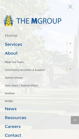
Clear CTA also help channel users around the site and the smaller menus that appear when a user is within each 'section' further aides this ability.
"We hope you will find us approachable and friendly" is the tag line of this firm and it certainly rings true with their simple and helpful mobile site. It's also worth checking out the cool animation when the burger menu opens up...very un-boring!
GRACE LOVES LACE
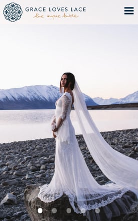
The opposite of bold, bash coffee may just be the delicate nature of lace. The Australian wedding dressmaker Grace Loves Lace goes to some length to provide a beautifully stylistic mobile site.
Detailed high-quality images are the go-to here, and on the larger screens - which are beginning to become the norm now - this appears to be an excellent move.
A slick burger menu directs traffic from the Home page and the principle of 'less is more' is followed throughout. Everything has been done to reduce the distraction from the main selling point of Grace Loves Lace.
The LooSE BoX
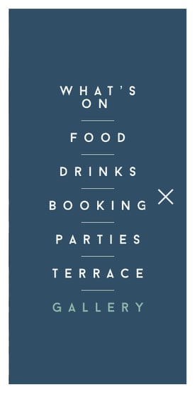
The best till last I think. This Westminster bar and kitchen takes full advantage of quirky animations and a slick sticky-bar menu (a menu that is locked into place so that it does not disappear when the user scrolls down the page), which ensures users have access to the enitre site at all times.
The home screen animation is pleasing, and again a good use of high-quality images makes it a pleasurable UX throughout.
Utilising the latest technology, The Loose Box have ensured this is a full screen liquid layout (that adjusts to the user's screen resolution) site. With retina-optimized graphical assets the result is a cool, seamless site which is a perfect example of one of my favourite mobile website designs. Nailed it!
Conclusions
So what exactly can we take away from the sites detailed above? That your branding can be applied to every aspect of your company up to and including the design and functionality of your mobile site. Simplicity, as with most things, is best. Don't over complicate a design with excessive menus and cluttered text.
And use high-quality images! You are far more likely to grab the attention of a potential user instantly with an engaging and beautiful picture.
More from Website Conversions

5 Examples of Great e-Commerce Websites Nailing it
As with football teams and music, the digital team at Purple Frog has its favourites when it comes to e-Commerce websites and...
Is Your Site Delivering a Great User Experience?
'User Experience is not a differentiator anymore; it's a necessity' This, from The State of UX in 2016, underlines that...


